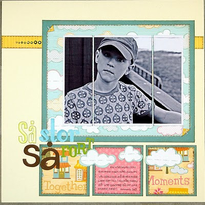
 ...and ended up a bit different, but I have to change sketches from time to time when it doesn´t really suit the rest of the design! This is my take, using the fun and colourful My Little Shoebox pp´s! I love them! I cut the photo in 3 pieces to give it an extra touch and used the clouds instead of the buttons (that was suggested). I love creating using sketches and get my creative juices flowing when I find one really inspiring!
 BTW! This sketch is "Sketch of the Month" at the Scrapfit´s Forum.
Thanks for stopping by! /Pia

4 kommentarer:
I adore this layout! You really used the sketch and made it your own.
Åh, den är såååå fin!!!!
vilket roligt sätt att använda skissen på! man måste ju inte klämma in tre kort.
ska försöka komma i håg denna idéen!
Love the way you have cropped the photo. The layout is gorgeous and the Little Shoebox papers are way too cute!
Skicka en kommentar